
Gruha
Real estate app for a happy home buying experience
Client: Gruha
Role: UX/UI Designer
Project Details:
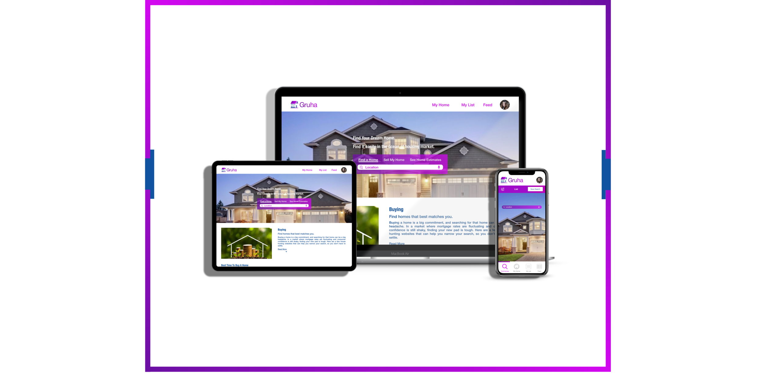
Gruha is a real estate app that I worked on during my career initial steps. This is easy to use app for all the newbies to power users of home buying. This is a responsive web app, and buyers can use it flexibly, no matter where they are. The smooth navigation, easy search function, favorites, and all other features help buyers in making their tasks easy and happy.
Contribution:
Persona creation, user stories, user flows, wireframes, moodboards, style guides, design system, A/B preference testing, mockups, animations, and prototypes.
Tools Used:
Sketch, Photoshop, Illustrator, Invision, Abstract, Pen & Paper, Balsamiq Mockups, Usability Hub, Keynote, Flinto, and Principle.
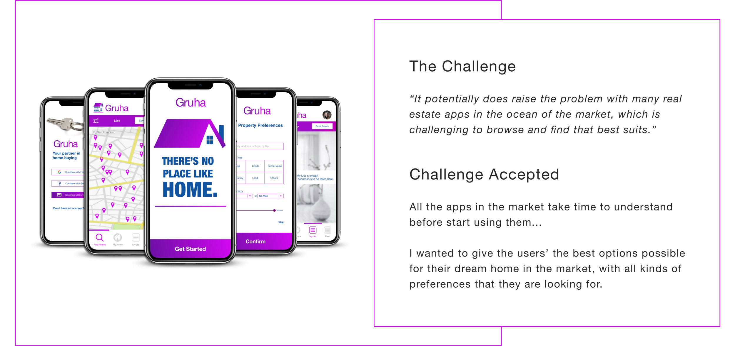
Approach
Work on the app with a focus on the user-centered design process to best suit the app from newbies to the power users of the real estate apps. Describe the analytical and statistical factors for the apps space in the real estate market. How does the customer use the app that they are new to the business and technology?
How I supported
Collaborated with researcher, design lead, and product managers to articulate goals and align on the key messages.
Helped establish Information Architecture of app
Helped create a persona, user stories, and user flows in following the UCD process
Worked to develop a comprehensive style guide
Conducted an A/B preference testing
Conducted usability tests with stakeholders and new users and retain feedback
Designed and iterated the screens based on the user feedback
Worked on the app illustrations
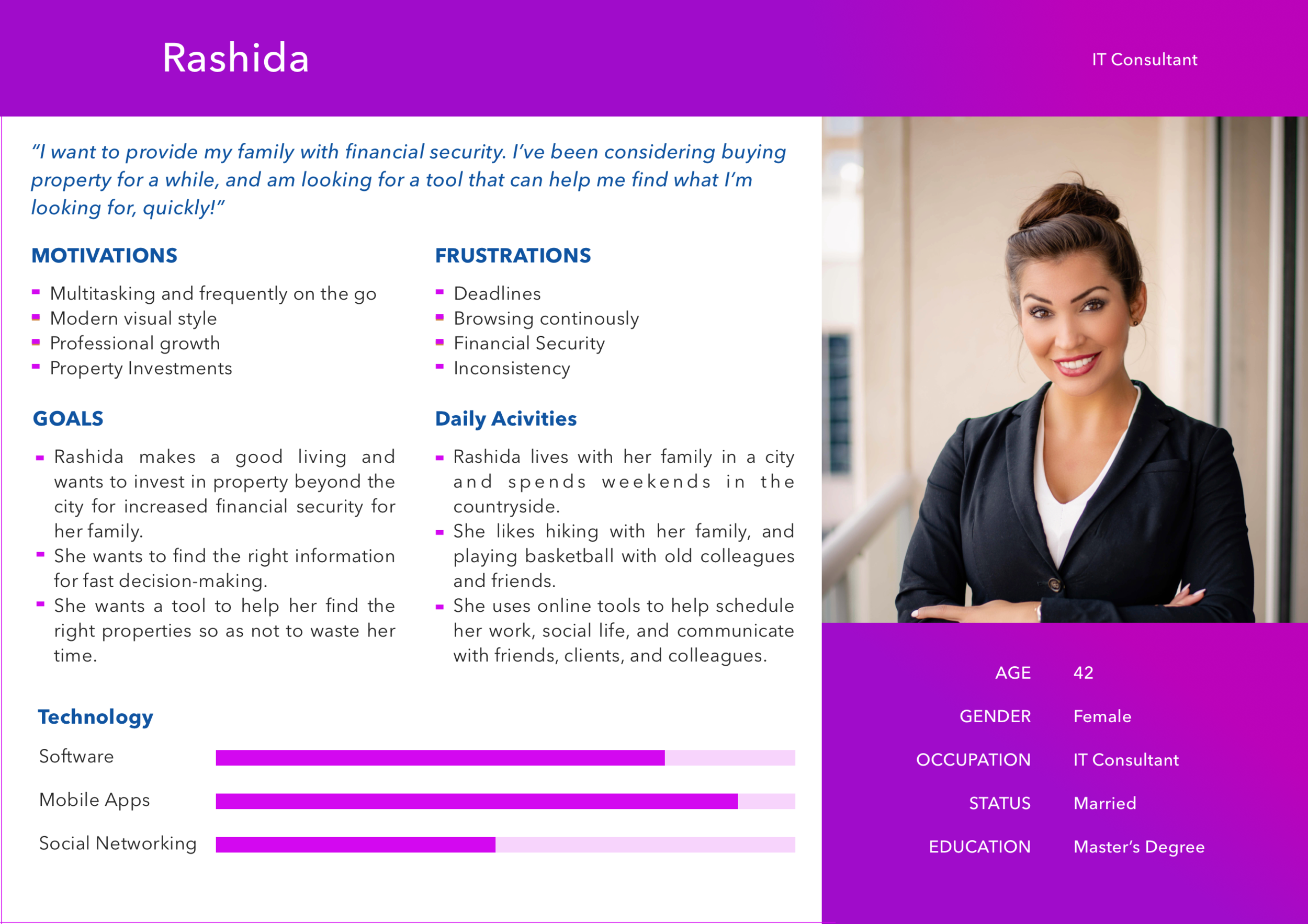
Persona
My approach for this app started with crafting a persona and writing user stories for it. This helped me to understand and solve the problem of the users for whom I’m building this app.
User Stories
“As a user, I want to create a profile containing all my property criteria, so that I am recommended results most relevant to me.”
“As a user, I want to be able to search and filter properties, so that I can find good matches based on my needs.”
“As a user, I want to be able to save or mark properties I am interested in, so that I can easily revisit them.”
“As a user, I want access to as much written and visual information as possible about properties I’m interested in, so that I can make an informed decision.”
“As a user, I want to be able to contact the right people if I am interested in viewing a property, so that I schedule a viewing.”
User Flows
User stories helped to understand the user goals better and to keep my product focus on the user. By creating the user flows, I addressed the core tasks necessary to start my journey. They helped me to establish the information architecture of the app.
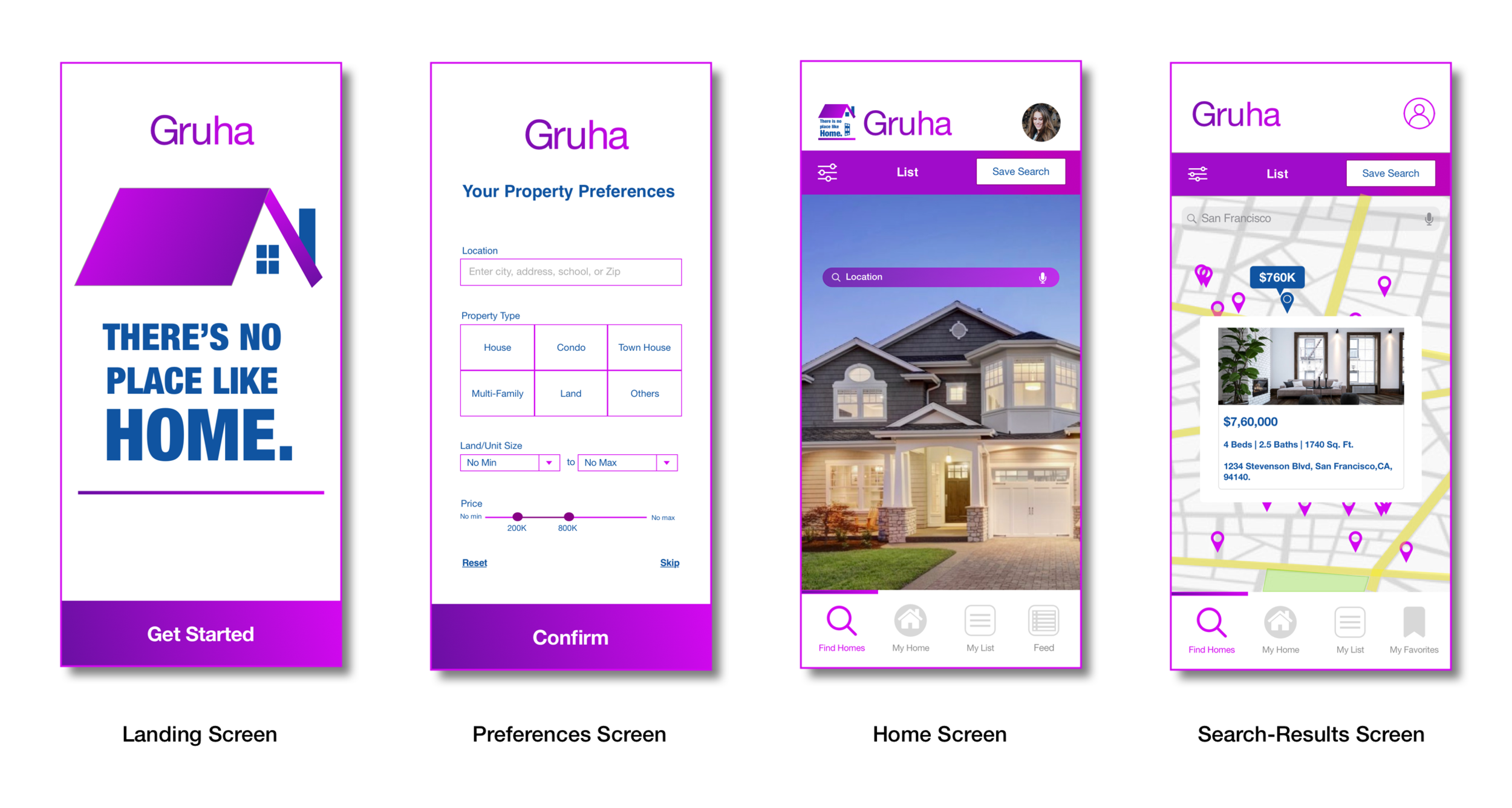
Wireframes
The structure of Gruha began with an idea, which I started crafting them first into low-fidelity wireframes.
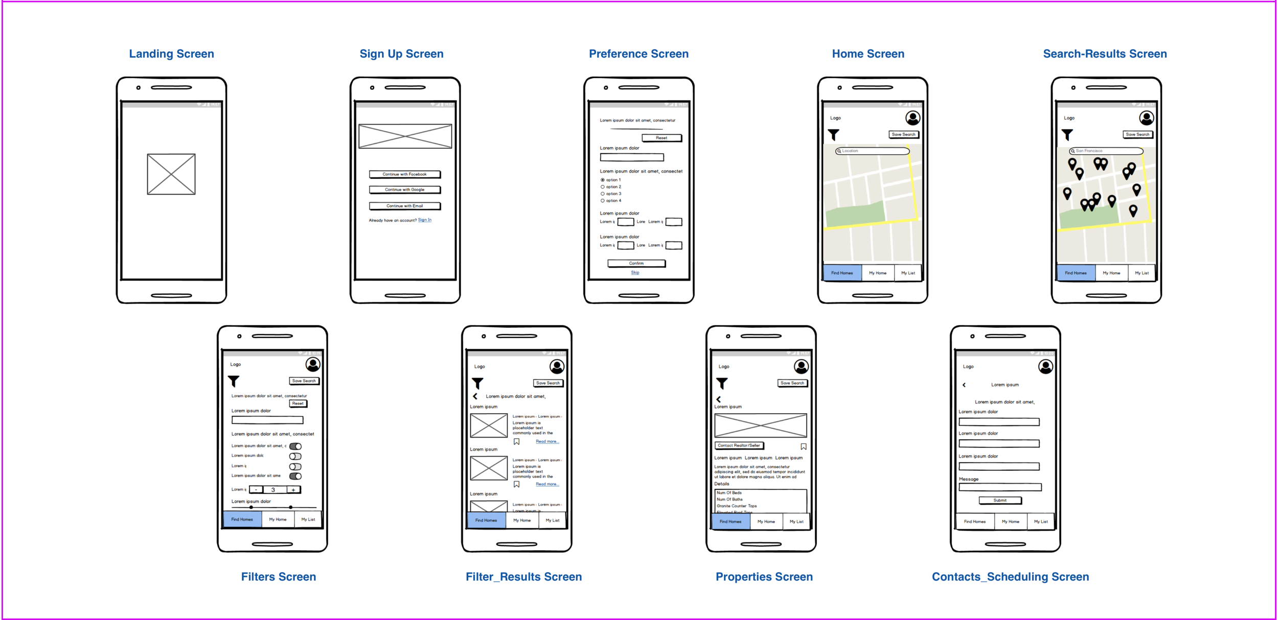
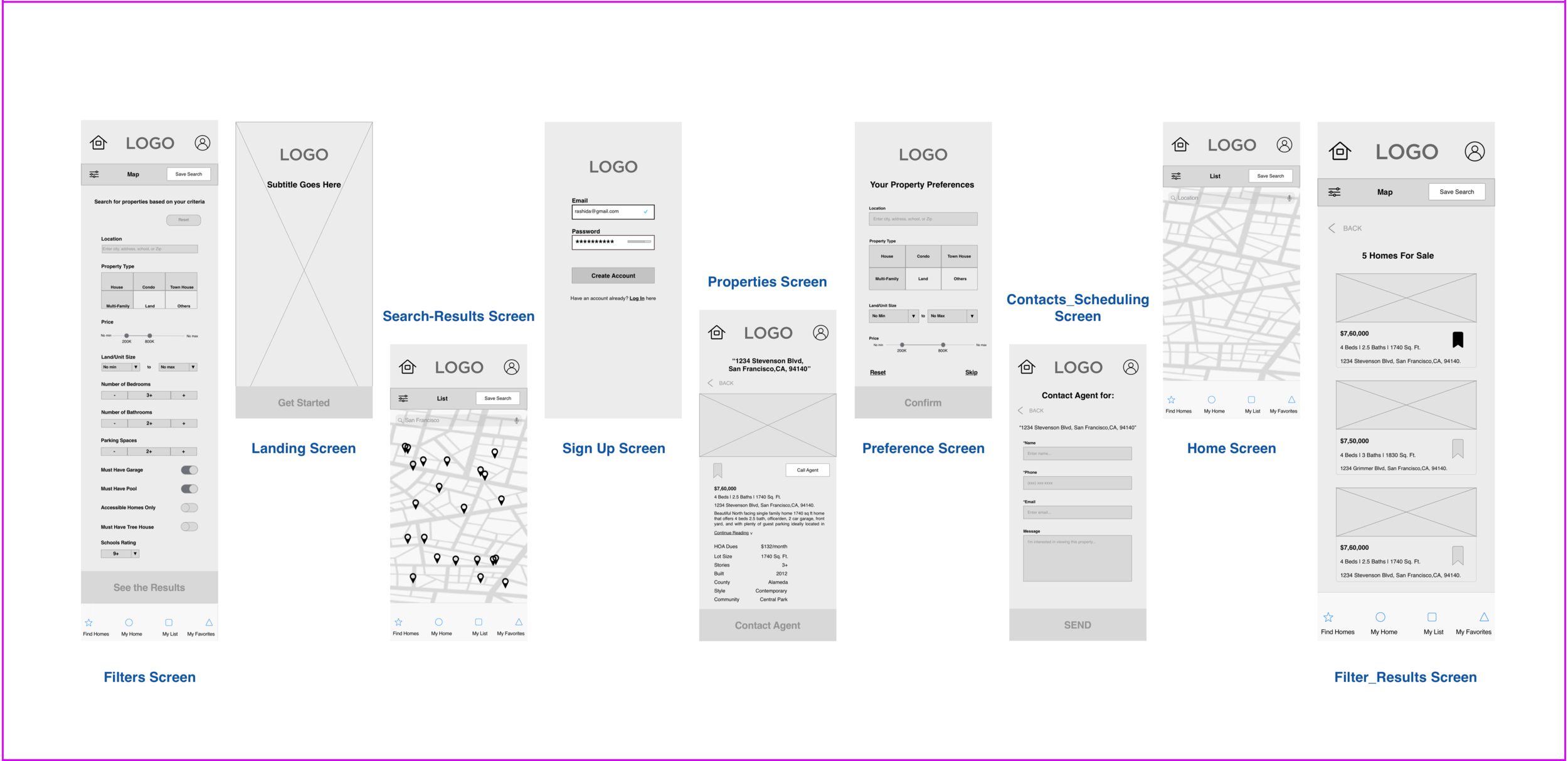
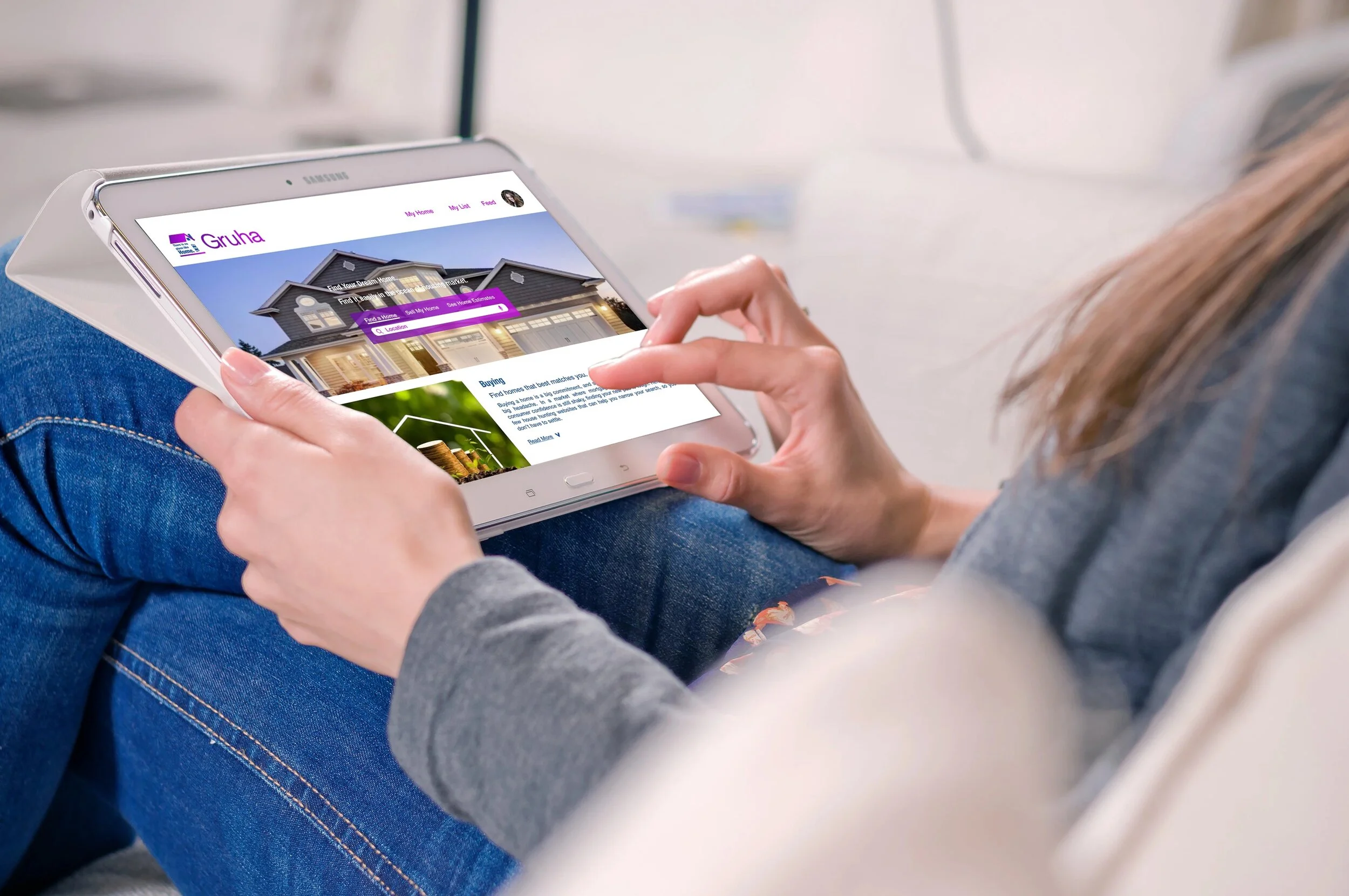
Before transferring to mid-fidelity, I took care to establish a responsive grid system to help maintain consistency across all the devices. Now, I iterated my low-fidelity wireframes to mid-fidelity wireframes by choosing a 12 column grid system. A few additional screens were also added during this phase.
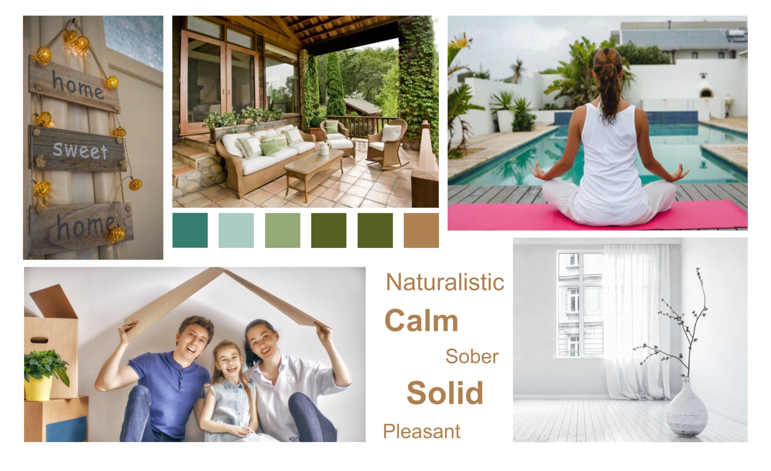
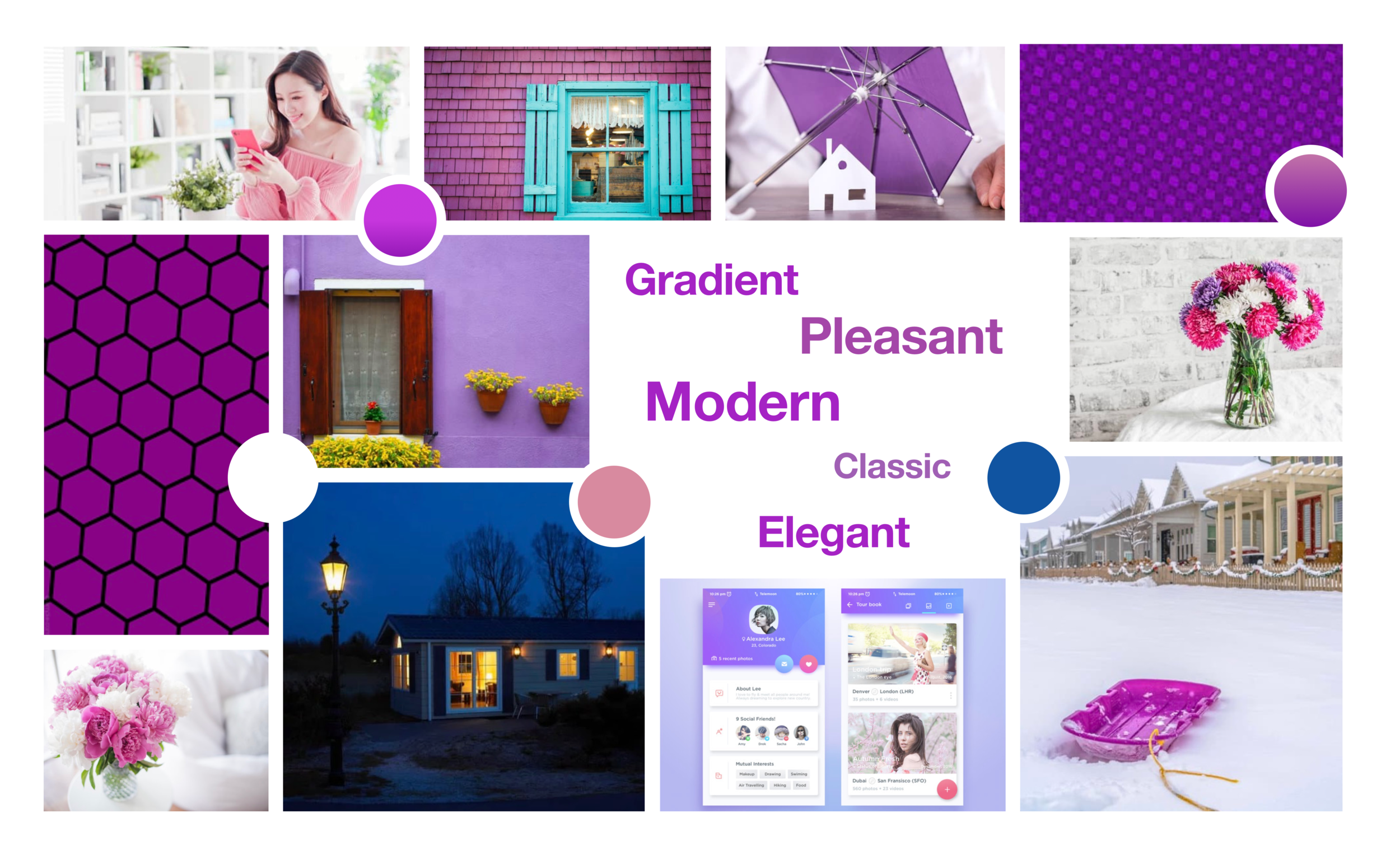
The ideation and conceptualization lead to few iterations of wireframes. The foundation for gruha is established, and now it’s time to work on the styling of the app - visual design. I got the inspiration for colors, typography, imagery by creating the mood boards.
I have created two different mood boards naturalistic and modern. I decided to move forward with my second mood board "modern" because I felt it did a better job by conveying the modern and elegant look, which better suits to pull the users to use the app.
Moodboards
Now it’s time to apply the typography, colors, images, and icons to the wireframes. Aesthetic adjustments are made and Grids are applied to fine tune the structural adjustments as needed. It’s a show time for the style guide of gruha.
Style Guide
Illustrations
Illustrations must be simple, edgy, and align with the brand guidelines.
They can be used along with the images but must maintain the consistency.
They need to be used only in the way they can explain the core concept and idea of the app.
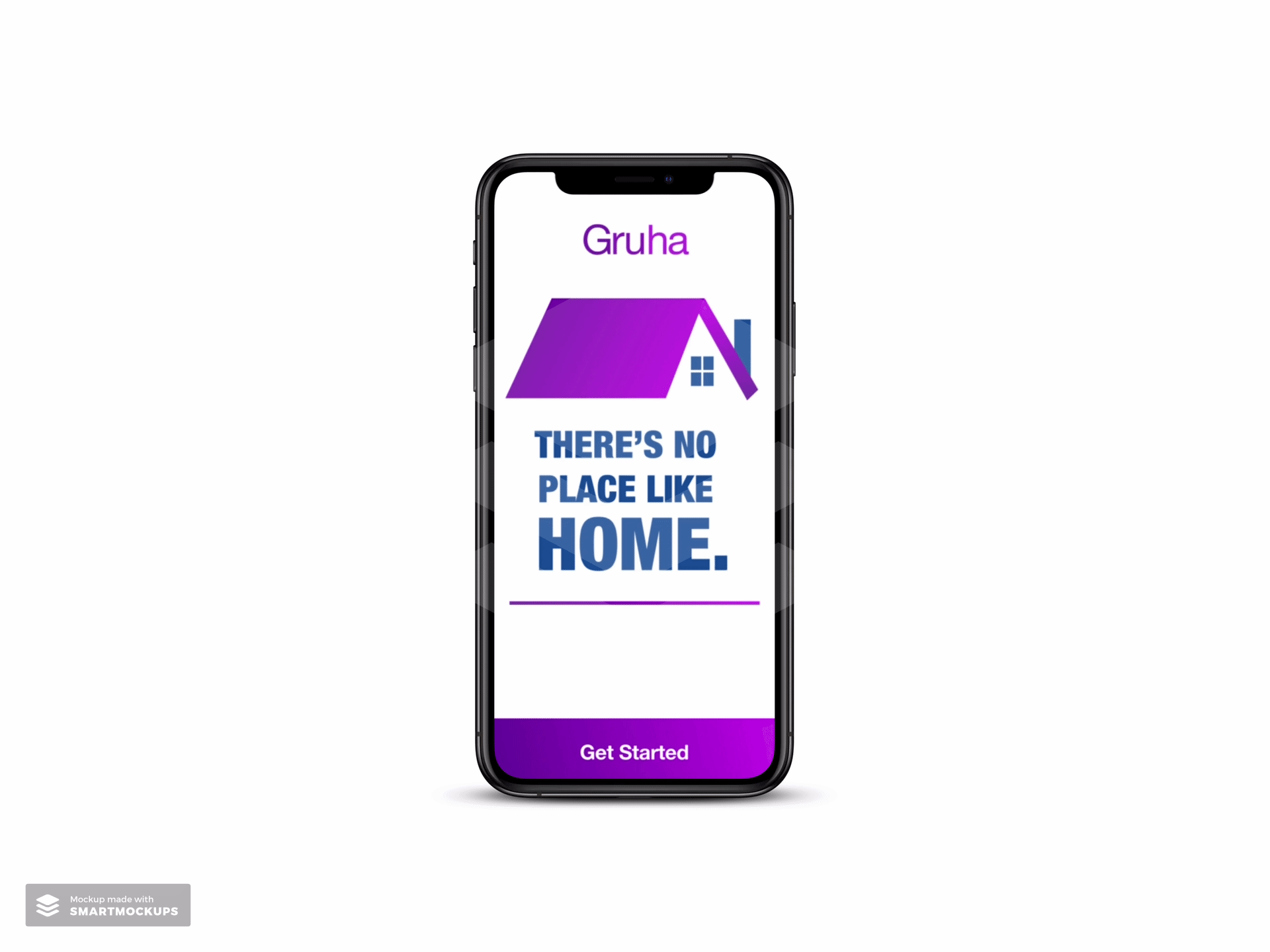
Logo & App Icon
The logo is to be used on a white background only.
The emblem can be specified separately from the embark only once the brand is completely established.
The logo can be scaled up or down while maintaining the resolution for the sizes of mobile, tablet, and desktop.
Color Palette
Iconography
Grid & Spacing
UI Elements
Animations
Animations should align with the brand guidelines.
They need to be included only when it full fills the purpose, but not including them for the sake of inducing.
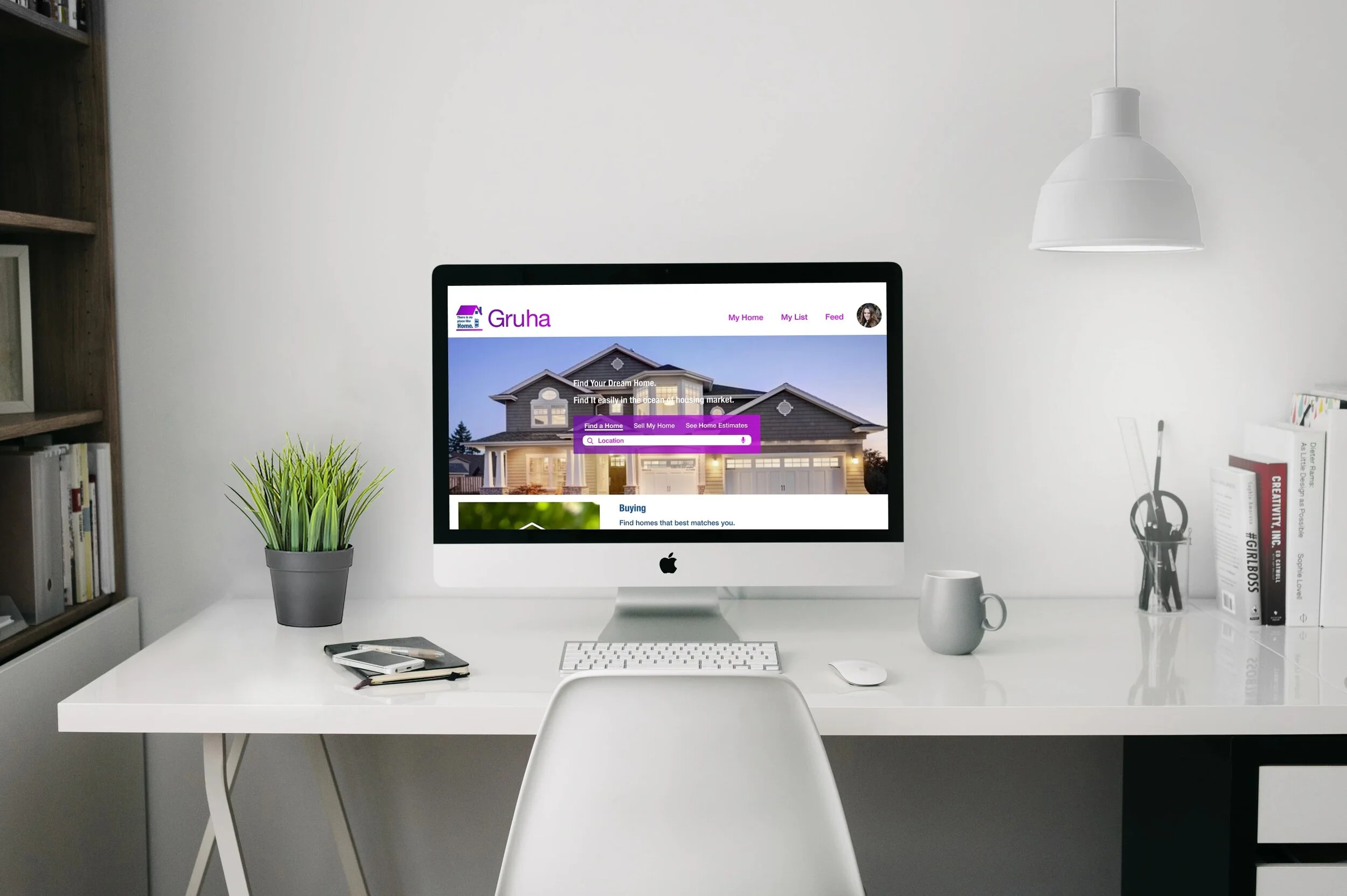
I got feedback from the design peers and few users’ in the space of the real estate app, and now I have everything needed to mold my wireframes into high-fidelity wireframes and mockups. As I followed the mobile-first design approach, I designed my two larger breakpoint screens after completing my rework and finalizing all of the mobile screens.
Every care is taken to make each screen appear and in line with the Gruha branding. In the final stage, I got stuck with two screens where both have two different kinds of designs and not sure to move with which. So, I decided to go for an A/B preference testing with a few audiences.
A/B Preference Testing
From the A/B preference testing, Landing 1 and Signup 2 screens got the highest results, and I feel satisfied with the results and decided to move on with the testing results. As I got clarification, now I decided to proceed further with my final high-fidelity wireframes, and mockups are ready for my stakeholders.
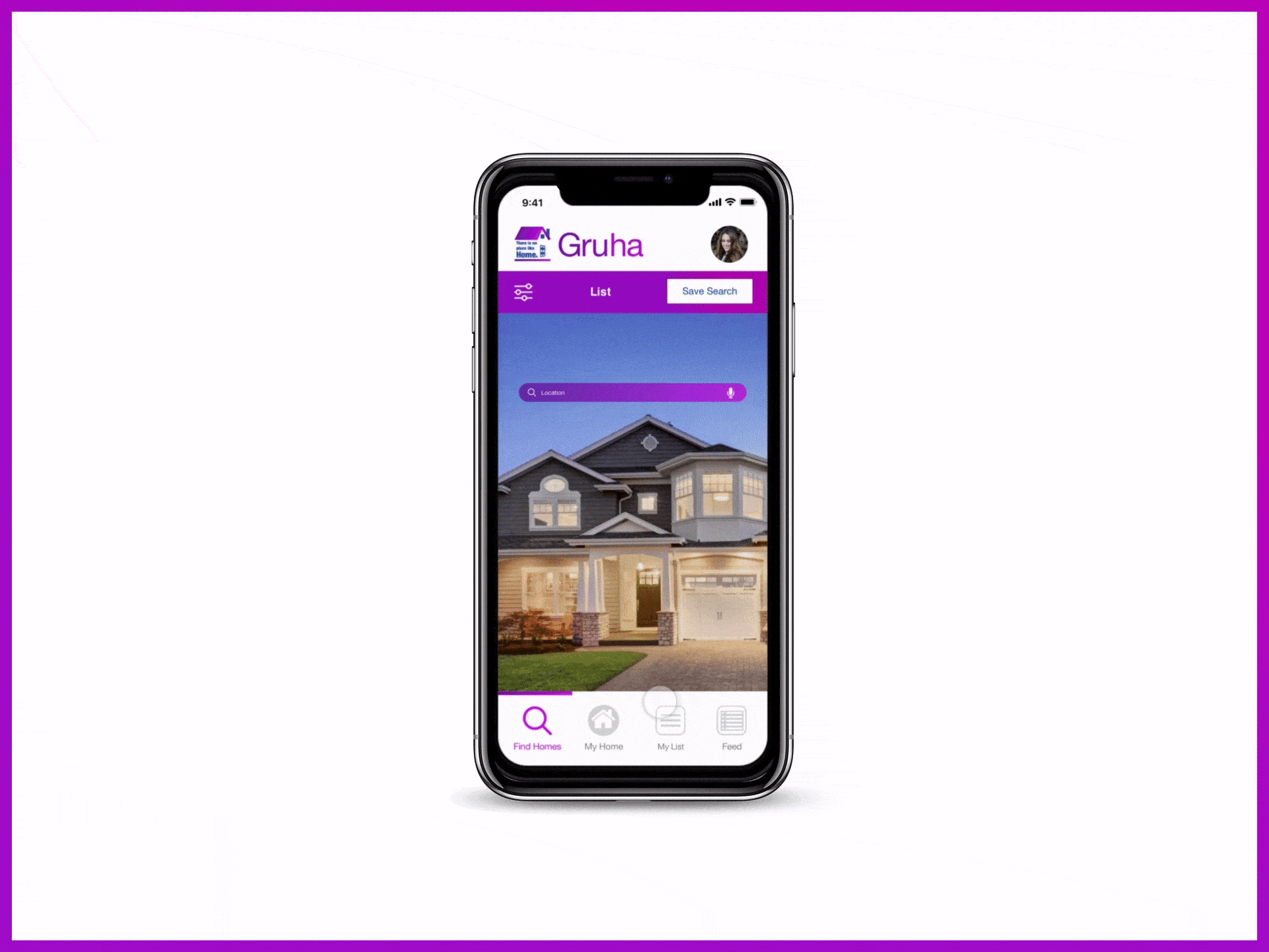
High-Fidelity Comps
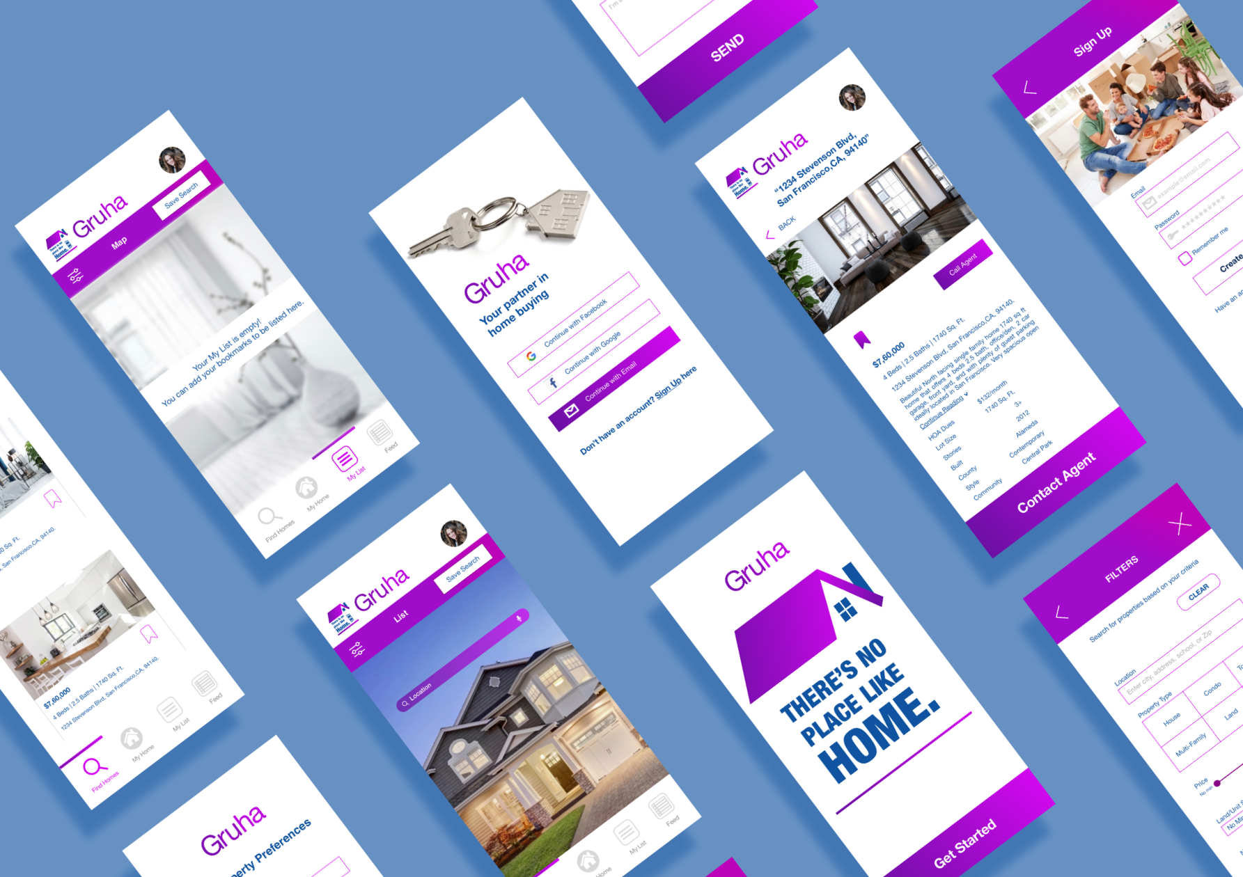
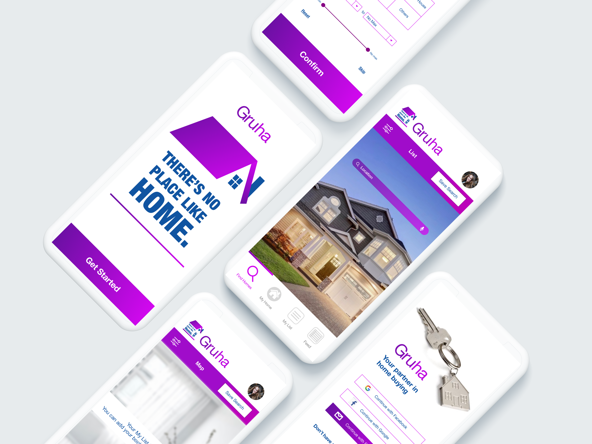
I worked on Flinto and Principle for creating the animations. I used Invision to create the prototype.
Retrospective
I enjoyed every step of the design process and learned a lot of new things during this project. I did vague research on the real estate market and existing marketplace apps as I'm new to the home buying process experience. I enjoyed crafting the personas, and user flows, that helped me to start my wireframing. I learned how to craft pixel-perfect designs and mockups. The preference testing I conducted exposed me to the great insights and clarity regarding my designs. By the end of this project, I excelled in my skills in Principle, Flinto, and Invision.